Matplotlib是一个功能强大的数据可视化Python库,利用它可以绘制折线图(plot), 柱形图( bar), 直方图(hist), 饼图(pie), 箱线图(box), 密度图(kde), 面积图(area), (散点图 (scatter), 散点图矩阵(scatter_matrix) 等。 通过matplotlib.pyplotlib子库可以方便的绘制各种图像,可以像在Matlab中绘图 那样方便。
通常使用matplotlib绘图有隐式(pyplot-style)与显式(object-oriented (OO) style)两种,前者是在绘图时pyplot的函数会自动实例化并管理Figure、Axes等Matplotlib可视化类,后者则需要用户创建方法Figure以及Axes类,然后通过对可视化类的操作来绘图。一般在程序性使用什么方式并没有明确的要求,可以使用某一种,甚至可以混用,在官方文档中给的建议是:
将pyplot-style使用在交互式绘图(如在Jupyter Notebook),OO-style用于非交互式绘图(如在函数或脚本中),对于复杂图像绘制推荐使用面向对象的API (OO-style)。1
基础操作
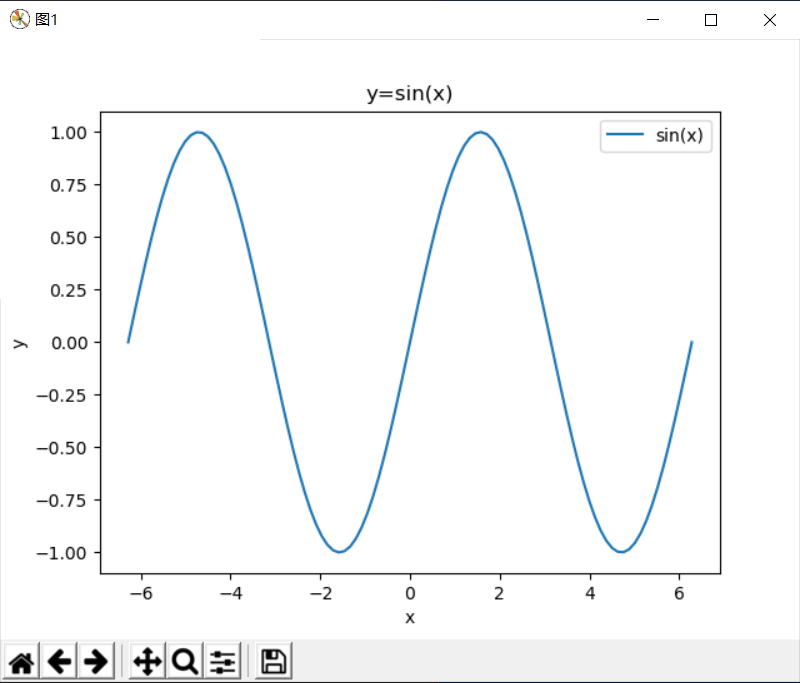
如果使用pyplot-style方式绘图,操作同Matlab几乎一样的。比如绘制一段正弦曲线: 示例1、matplotlib.pyplot绘图:
 import numpy as np
 import matplotlib.pyplot as plt
 import matplotlib as mpl

 x = np.linspace(-2*np.pi,2*np.pi,100)
 y = np.sin(x)

 fig=plt.figure(num='图1')
 plt.plot(x,y,label='sin(x)')
 plt.legend()
 plt.title('y=sin(x)')
 plt.xlabel('x')
 plt.ylabel('y')
 plt.show()
输出效果
示例2、Matlab绘图:
 x=linspace(-2*pi,2*pi,100);
 y=sin(x)
 fig=figure('Name','图1');
 plot(x,y)
 legend('sin(x)')
 title('y=sin(x)')
 xlabel('x')
 ylabel('y')
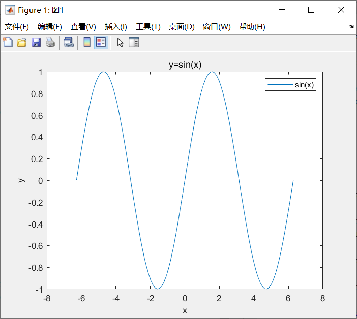
在pyplot-sytle中使用plt.plot()时自动创建了Figure、Axes,后面的操作都是针对当前Figure(gcf),当前Axes(gca)操作;对于OO-style,也就是面向对像的方式,需要先实例化Figure以及Axes才能在Axes上绘图。
下面代码是OO-Style,绘图效果与pyplot-style相同
实例3、面向对象的绘图方式
 fig,ax=plt.subplots() # 创建一个Figure并添加一个Axes
 # # 或者
 # fig = plt.figure()
 # ax = fig.add_subplot()
 ax.plot(x,y,label='sin(x)')
 ax.legend()
 ax.set_title('y=sin(x)')
 ax.set_xlabel('x')
 ax.set_ylabel('y')
 fig.show()
 plt.show() # 在脚本中使用fig.show()图像不能停留
两种方式添加绘图区添加title、label等元素的方式有所不同,前者是使用pyplot的函数(如plt.title()),而后者是使用类的方法(ax.set_title()),二者函数明不同但是使用的参数是相同的。
绘图函数
matplotlib可以内置许多绘图函数,这里可以查看所有可用的图形类型,下面介绍用于绘制折线图、散点图、条形图、直方图、饼图、箱线图等图形的函数。
所有绘图函数都将numpy.array或numpy.ma.masked_array作为输入。“array-like”类型(如pandas数据对象和numpy.matrix)不一定能正常使用。最好将其转换为numpy.array对象。
plot
通常用于绘制折线图,如示例1中使用的方式,plot函数的调用格式:
 plot([x], y, [fmt], *, data=None, **kwargs)
 plot([x], y, [fmt], [x2], y2, [fmt2], ..., **kwargs)
fmt是格式字符串,有三个字符表示线型(linestyle or ls)、标记点样式(marker)、颜色(color or c)的简化方式:fmt = '[marker][line][color]'
marker, line,color的可选值
| marker | 标记 | color | 颜色 | line | 线型 |
|---|---|---|---|---|---|
'.' |
点 | 'b' |
蓝色(blue) | '-' |
实线 |
',' |
像素点 | 'g' |
绿色(green) | '--' |
虚线 |
'o' |
圆圈 | 'r' |
红色(red) | '-.' |
点划线 |
'v' |
下三角 | 'c' |
青色(cyan) | ':' |
点线 |
'^' |
上三角 | 'm' |
品红(magenta) | ||
'<' |
左三角 | 'y' |
黄色(yellow) | ||
'>' |
右三角 | 'k' |
黑色(black) | ||
'1' |
tri_down | 'w' |
白色(white) | ||
'2' |
tri_up | ||||
'3' |
tri_left | ||||
'4' |
tri_right | ||||
's' |
square | ||||
'p' |
pentagon | ||||
'*' |
star | ||||
'h' |
hexagon1 | ||||
'H' |
hexagon2 | ||||
'+' |
plus | ||||
'x' |
x | ||||
'D' |
diamond | ||||
'd' |
thin_diamond | ||||
'|' |
vline | ||||
'_' |
hline |
更多marker,对于颜色,除了上面的颜色字符外,还可以使用rgb元组(R,G,B)等方式指定。
其他更多属性(alpha, linewidth等)设置,详见matplotlib.lines.Line2D。也使用plt.setp()可以查询、设置属性
 theline = plt.plot(x,y)
 print(plt.setp(theline)) # 输出theline的属性
 plt.setp(l1,color='r') # 设置theline的颜色为红色
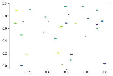
scatter
虽然plot可以使用'.'标记绘制简单的散点图,但scatter可以实现更丰富的效果,表达更多维度的信息。相比与plot,scatter还有与x,y元素数相同的s,c参数用于指定标记点的大小与颜色。此外还有marker用于指定标记点、alpha透明度等参数,
示例4、自定义标记形状的散点图
 import matplotlib.pyplot as plt
 import numpy as np

 # unit area ellipse
 rx, ry = 3., 1.
 area = rx * ry * np.pi
 theta = np.arange(0, 2 * np.pi + 0.01, 0.1)
 verts = np.column_stack([rx / area * np.cos(theta), ry / area * np.sin(theta)]) # 椭圆路径

 x, y, s, c = np.random.rand(4, 30)
 s *= 10**2.

 fig, ax = plt.subplots()
 ax.scatter(x, y, s, c, marker=verts)

 plt.show()
条形图
bar用于绘图条形图,barh可以绘制横向条形图;二者区别仅前三个参数不同:
 plt.bar(x,height,width=0.8) # 条形图
 plt.barh(y, width,height=0.8) # 横版条形图
示例5、带有误差线的累积条形图
 import numpy as np
 import matplotlib.pyplot as plt


 labels = ['G1', 'G2', 'G3', 'G4', 'G5']
 men_means = [20, 35, 30, 35, 27]
 women_means = [25, 32, 34, 20, 25]
 men_std = [2, 3, 4, 1, 2]
 women_std = [3, 5, 2, 3, 3]
 width = 0.35       # 条带的宽度: 也可是长度为len(x)的序列

 fig, ax = plt.subplots()
 ax.bar(labels, men_means, width, yerr=men_std, label='Men')
 ax.bar(labels, women_means, width, yerr=women_std, bottom=men_means,
        label='Women')

 ax.set_ylabel('Scores')
 ax.set_title('Scores by group and gender')
 ax.legend()
 plt.show()
hist
直方图通常用于表示连续数据的分布情况,在Matplotlib中hist用于绘制条形图,同时还会返回直方图中每个分组的数量及分组的边界。bins参数控制分组数量或者定义分组,density参数指定是否将统计结果归一化,color指定直方图颜色(一组数据一种颜色),更多参数可以查看官方文档。此外使用bar也可实现直方图的效果
示例6、直方图示例
  import random
 random.seed(1000)
 x=np.random.randn(1000,2)

 fig, ax = plt.subplots(2,2)
 fig.set_size_inches(10,10) # 设置图像大小

 ax[0,0].hist(x,bins=10,label=['data1','data2'])
 ax[0,0].legend()
 ax[0,0].set_title('10 groups')

 bins = [-3,-2,-1,0,1,2,3]
 ax[0,1].hist(x,bins=bins,label=['data1','data2'],density=True)
 ax[0,1].legend()
 ax[0,1].set_title('Use sequence grouping')
 # od=np.histogram(x[:,1])
 # plt.bar(od[1][:-1],od[0],align='edge')

 ax[1,0].hist(x,bins=bins,label=['data1','data2'],density=True,stacked=True)
 ax[1,0].legend()
 ax[1,0].set_title('Stack groups of data')

 hdat0 = np.histogram(x[:,0],bins=bins,density=True)
 hdat1 = np.histogram(x[:,1],bins=bins,density=True)
 ax[1,1].bar(hdat0[1][:-1],hdat0[0],align='edge',width=1,label='data1')
 ax[1,1].bar(hdat1[1][:-1],hdat1[0],bottom=hdat0[0],align='edge',width=1,label='data2')
 ax[1,1].legend()
 ax[1,1].set_title('use bar funtion')
 plt.show()
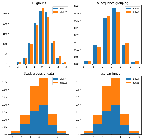
此外还有hist2d可以绘制双变量直方图。
pie
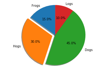
pie用于绘制饼图,并返回饼图表示各部分标签及百分比的Text类列表,patches, texts, autotexts=pie(x, explode=None, labels=None, colors=None)当sum(x)<1时,会把x中各元素当作百分比,且缺失的部分在饼图中显示为空白,explode参数指定各部分的偏移量,labels指定各部分标签,color指定颜色。
示例7、分离式饼图
 # 饼图,按逆时针方向排列和绘制
 labels = 'Frogs', 'Hogs', 'Dogs', 'Logs'
 sizes = [15, 30, 45, 10]
 explode = (0, 0.1, 0, 0)  # 只分离'Hogs'

 fig1, ax1 = plt.subplots()
 ax1.pie(sizes, explode=explode, labels=labels, autopct='%1.1f%%',
         shadow=True, startangle=90)
 ax1.axis('equal')  # 等比例坐标轴,确保将饼图绘制为圆。
 plt.show()
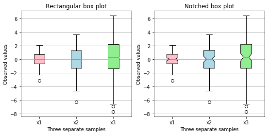
boxplot
boxplot用于绘制箱线图,会返回一个包含boxes、medians、whiskers、caps 、fliers、means的字典。箱线图主要中包含数据的上边缘值、上四分位数、中位数、下四分位数、下边缘值及异常值,可以通过设置对于参数来做相应的处理。 示例8、自定义颜色的箱线图
 np.random.seed(19680801)
 all_data = [np.random.normal(0, std, size=100) for std in range(1, 4)]
 labels = ['x1', 'x2', 'x3']

 fig, (ax1, ax2) = plt.subplots(nrows=1, ncols=2, figsize=(9, 4))

 # 矩形 box plot
 bplot1 = ax1.boxplot(all_data,
                      vert=True,  # vertical box alignment
                      patch_artist=True,  # fill with color
                      labels=labels)  # will be used to label x-ticks
 ax1.set_title('Rectangular box plot')

 # 有缺口 box plot
 bplot2 = ax2.boxplot(all_data,
                      notch=True,  # notch shape
                      vert=True,  # vertical box alignment
                      patch_artist=True,  # fill with color
                      labels=labels)  # will be used to label x-ticks
 ax2.set_title('Notched box plot')

 # 填充颜色
 colors = ['pink', 'lightblue', 'lightgreen']
 for bplot in (bplot1, bplot2):
     for patch, color in zip(bplot['boxes'], colors):
         patch.set_facecolor(color)

 # 添加横向网格线
 for ax in [ax1, ax2]:
     ax.yaxis.grid(True)
     ax.set_xlabel('Three separate samples')
     ax.set_ylabel('Observed values')

 plt.show()
其他绘图函数
除了上面介绍的较为常用的绘图函数外,matplotlib还有polar、psd()、specgram()、cohere()、step()等更多绘图函数。
样式设置
通常个函数画出图像后会有一个默认的样式,matplotlib有多种内置样式,可以使用matplotlib.style.available查看可用样式,使用matplotlib.style.use('样式名')修改默认样式,不同的样式可以相互组合plt.style.use(['dark_background', 'bmh']) 。当然,默认样式通常不能满足需要,为让图像能更好的传达信息,让图像更美观,还需要对图表样式做一定的调整。
也可以使用临时样式:
# 样式只在with代码块起作用
with plt.style.context(['dark_background', 'bmh']):
    plt.plot(np.sin(np.linspace(0, 2 * np.pi)), 'r-o')
plt.show()
网格、图例、标题,轴标签
- grid
grid( b=None, which='major', axis='both', |*|*kwargs)控制坐标网格的显示及样式,当所有参数缺省时表示切换网格的可见性。which:{‘major’, ‘minor’, ‘both’}指定网格类型主网格、副网格或者二者都有,axis:{‘both’, ‘x’, ‘y’}指定x、y轴方向的网格。其他参数color,linestyle, linewidth等。 -
legend(Axes.legend,pyplot.legend,Figure.legend)
Axes.legend是在该Axes上显示图例,第二个是在当前Axes上显示图例,最后一个是在该Figure上显示图例,可指定参数设置字体大小fontsize等属性或使用setp修改、查询。
有三种调用方式:1、legend(),2、legend(labels),3、legend(handles, labels),方式1、显示已有的legend元素(即label参数的值),如果没有则不能正常显示, 示例9、图例的显示fig,((ax1,ax2),(ax3,ax4))= plt.subplots(2,2,figsize=(10,10)) x = np.linspace(0,10,20) y=np.sin(x) y1=np.cos(x) ax1.plot(x,y,'o-',x,y1,'x-') ax1.legend(['sin(x)','cos(x)']) lins = ax2.plot(x,y+1,'+-',x,y1+1,'*-') ax2.legend(lins,['cos(x)+1','sin(x)+1']) lins = ax3.plot(x,y+1,'y1-',x,y1+1,'k*-',label=['sin(x)+1(y)','cos(x)+1(k)']) ax3.legend(loc='best') plt.plot([1,2,3,5]) ax4.legend(['line']) fig.legend(['1','2','3','4'])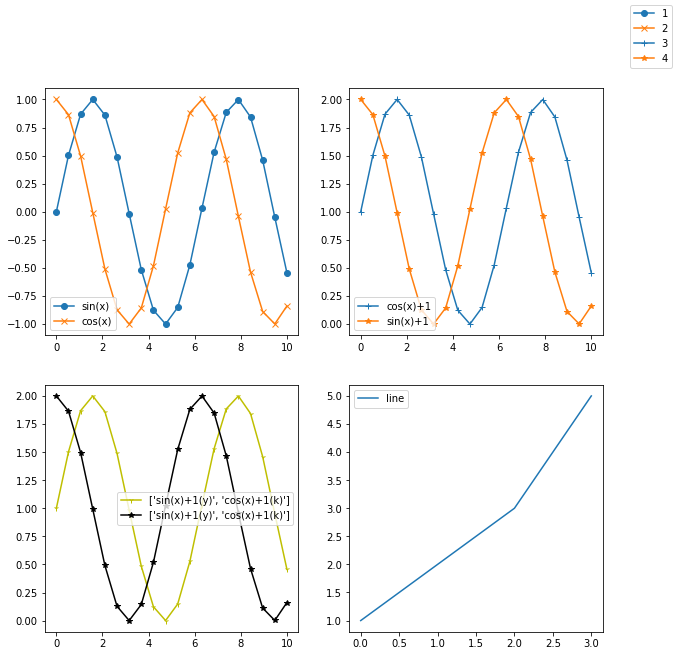
- 标题
Axes、Figure、legend等都有标题,设置方法也很多,如Axes标题
plt.title('str')(作用与当前Axes),Axes.set_title('str')以及使用setp函数。Figure的标题可以使用plt.suptitle('str'),fig.suptitle('str'),legend标题可以使用legend(title='str'),legend.set_title('set')以及pyplot.setp函数或set方法设置标题。 - xlable,ylabel
下面几个方法可以用于设置坐标轴的名称:
plt.xlabel('str'),plt.ylabel('str'),Axes.set_xlabel('str'),Axes.set_ylabel('str')以及set(ylabel=’str’,xlabel=’str’)方法。
坐标轴样式
matplotlib除了常规坐线性标轴外,还支持对数、时间序列等坐标轴,还有极坐标等其他不同投影方式的坐标系。
- 坐标轴范围及刻度
- axis:pyplot函数、Axes方法;可以方便的获取、设置xy坐标轴的范围:
 xmin, xmax, ymin, ymax = axis() # 使用axis获取坐标轴范围
 xmin, xmax, ymin, ymax = axis([xmin, xmax, ymin, ymax])
 xmin, xmax, ymin, ymax = axis(option) # 坐标轴其他内置范围
 # option可以是bool值或字符串:
 # 'on'     显示坐标轴. 同``True``.
 # 'off'    不显示坐标轴. 同 ``False``.
 # 'equal'  修改xy轴范围,使xy轴等比例
 # 'scaled' 改变绘图框的范围,使xy轴等比例
 # 'tight'  使范围刚刚够显示数据
 # 'auto'   自动比例,填满Axes.
 # 'image'  'scaled' with axis limits equal to data limits.
 # 'square' 类似scaled,但是xmax-xmin=ymax-ymin
- axis:pyplot函数、Axes方法;可以方便的获取、设置xy坐标轴的范围:
- ylim,xlim: pyplot函数,设置xy轴范围
ylim([ymin,ymax]),ylim(ymin=value,ymax=value)使用Axes的方法set设置Axes的xlim,ylim属性 - ax.set(xlim=(xmin, xmax), ylim=(ymin, ymax))
- set_ylim,set_lim:Axes的方法,用法同ylim。
- xticks,yticks: pyplot函数;获取、设置x、y轴的刻度,如:
mf = font_manager.FontProperties(fname="./uming.ttc") # 实例化字体 xt_labels = ["10点{}分".format(i) for i in range(60)] xt_labels += ["11点{}分".format(i) for i in range(60)] plt.xticks(list(range(120))[::4], xt_labels[::4],rotation=-45, fontproperties=yf) # 将标签字符列表映射的数值列表 - get_xticks, get_xticklabels, set_xticks, set_xticklabels: Axes方法;获取x轴刻度及标签,设置x轴刻度及标签。类似使用xticks设置刻度及标签,set_*方法可以设置主副刻度。
- 其他自动范围:locator_params,autoscale,Axes.autoscale_view
- 坐标轴位置、双坐标轴
- set_ticks_position,spines:
set_ticks_position是XAxis、Yxais的方法用于设置坐标刻度及便签的位置;spines是表示绘图区域的上、下、左、右边界的类,Axes.spines可以获取Axes的四个Spine` , 示例10、绘制一个圆并放置坐标轴在原心
 y=np.sqrt(1-x**2)
 fig,ax=plt.subplots()
 ax.plot(x,y,'r-',x,-y,'r-')
 ax.axis('equal') # 等比例x、y轴
 tlt=ax.set(title='Circle')

 # 隐藏另一侧边框
 ax.spines['top'].set_color('None') # 设置上边界的颜色为空,不显示
 ax.spines['right'].set_color('None') # 设置右边界的颜色为空,不显示

 ax.xaxis.set_ticks_position('bottom')
 ax.yaxis.set_ticks_position('left')
 # 设置x、y轴位置
 ax.spines['bottom'].set_position(('data', 0)) # 设置下边界的位置
 ax.spines['left'].set_position(('data', 0)) # 设置左边界的位置
 plt.show()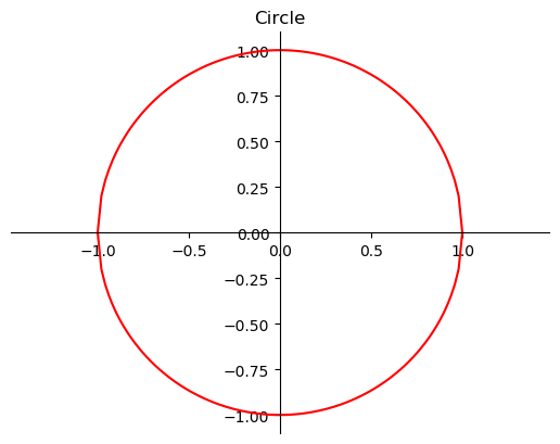
- set_ticks_position,spines:
- twinx,twiny: 创建第二的x、y轴;
pyplot.twinx(ax=None),Axes.twinx();
-
时间序列
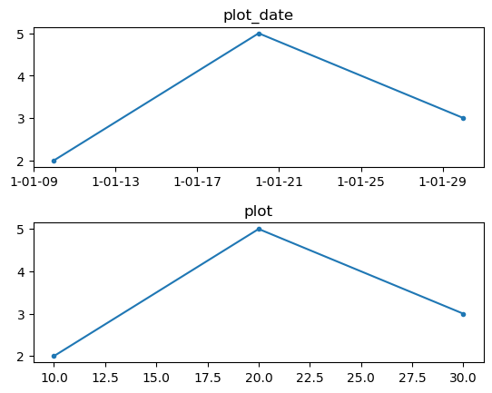
在对时间序列处理时使用plot_date可以轻松的绘制出含有时间刻度的图形,plot_date的使用方法与plot类似,不过plot_date能将数值类型的x、y值解释为时间序列。plot_date(x, y, fmt='o', tz=None, xdate=True, ydate=False) # tz:表示时区的字符串或tzinfo类,如果是None,则使用` rcParams["timezone"]`的设置(default: 'UTC'). # xdate: 是否将x轴解释为Matplotlib dates # ydate: 是否将y轴解释为Matplotlib datesMatplotlib 使用浮点数表示自0001-01-01 UTC以来的天数。如,对于
x=[10,20,30], y=[2,5,3],plot()与plot_date的区别:
此外,matplotlib还有dates模块可以用于时间处理,该模块是基于datetime、dateutil实现,借助该模块可以实现更丰富的时间轴设置。 locator_params()
https://blog.csdn.net/helunqu2017/article/details/78736686
-
对数轴
当数据跨越多个量级时,通常使用对数轴,在matplotlib中可以使用plt.xsacle('log')设置x轴为对数轴,还有Axes.set_xsacle('log'),'log'表示对数轴,'linear'表示线性轴,'symlog'、'logit'为其他形式的对数轴。yscale,set_yscale作用与y轴。自定义https://matplotlib.org/devel/add_new_projection.html#adding-new-scales -
投影 自定义投影https://matplotlib.org/devel/add_new_projection.html#creating-a-new-projection
其他文本(图例、注释等)
text任意位置文本,annotate带箭头注释) 文本
text()可以在任意为题添加文本,支持tex语法,xlable(),ylable(),title()添加特定位置文本。所有文本方法返回matplotlib.text.Text实例,同样可以使用step()查看 、设置属性。annotate()可以添加注释,由参数xy表示的要注释的位置和文本xytext的位置。这两个参数都是(x,y)元组。
Axes布局及多Figure
See Axes Demo for an example of placing axes manually and Basic Subplot Demo for an example with lots of subplots.
https://matplotlib.org/api/_as_gen/matplotlib.pyplot.subplots.html#matplotlib.pyplot.subplots 子图 多个坐标区域subplot subplot2grid( ), gridspec类 gridspec.Gridspec(3,3) ax1=plt.subplot(gs[0,:])
图像输出
使用savefig可以方便的输出多种格式的图像
 # 保存当前Figure图像
 plt.savefig(fname, dpi=None, format=None,transparent=False)
 # 保存fig的图形
 fig.savefig(fname, dpi=None, format=None,transparent=False)
 # fname: 文件名
 # dpi:分辨率(每英寸点数)
 # format:输出格式,'png', 'pdf', 'svg', ..., 如果没有,以fname的扩展名格式
 # transparent:是否透明
中文字体显示
Matplotlib本身并不支持中文字体的显示,若要正常显示中文字体需要进行一些设置,通常有两种方法:
- 局部设置,在需要时指定字体
# 这个方向指定的字体必须是系统存在的字体 plt.xlabel('时间',fontproperties='SimHei') # 设置x轴标签的字体 # 使用font_manager通过字体文件指定字体 font_path = './songti.ttf' _font = mpl.font_manager.FontProperties(fname=font_path) plt.xlabel('时间',fontproperties=_font) - 全局设置,当前程序中所有图形字体
matplotlib.rc()用于设置当前rc参数,通过它可以设置字体的参数## 以下3种写法效果相同 font = {'family' : 'monospace', 'weight' : 'bold', 'size' : 15} matplotlib.rc('font', **font) # 通过字典传入参数 # 关键字传参 matplotlib.rc('font', family='monospace',weight='bold',size=15) # 修改rcParams matplolib.rcParams['font.family']='monospace' matplolib.rcParams['font.weight']='bold' matplolib.rcParams['font.size']=15family:字体名称;font.style:字体风格,如 ‘normal’,’itaic’;font.size 字体大小。 一些常见字体:
字体 说明 SimHei 黑体 Kaiti 楷体 LiSu 隶书 FangSong 仿宋 YouYuan 幼圆 STSong 宋体
其他绘图工具:
- Seaborn: Seaborn是一个基于matplotlib的Python数据可视化库。它提供易于使用的高级接口,可以方便绘制
概率分布图(displot ),密度分布图(kdeplot),联合分布图(joinplot),箱线图(boxplots),回归图(lmplot),热力图( heatmap)等许多信息丰富的图形; - altair: Declarative statistical visualization library for Python;
- plotly: plotly是一个交互式的开源绘图库,它支持40多种独特的图表类型;
- Echart: 使用JavaScript实现的开源数据可视化框架,Python可以通过模块
pyecharts来调用Echart。
参考:
Pyplot tutorial — Matplotlib 3.2.1 documentation:
Python 数据分析与展示(北京理工大学 )
Python数据可视化分析 matplotlib教程
Python+Matplotlib制作动画 - EndlessCoding - 博客园: https://www.cnblogs.com/endlesscoding/p/10308111.html https://mp.weixin.qq.com/s/pu5k6HoAdL6RU1cffVB0nA